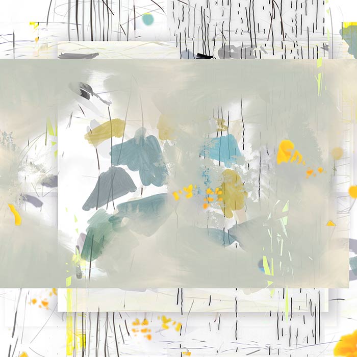
Wild Forest, No. 1 :
1/10 :
pigment ink on rag paper :
edition of 10 :
image size 30″h x 30″w, framed 32″h x 32″w :
©2017 by Michelle A. Hegyi
Michelle Hegyi: wild forest
I recently had the chance to ask Michelle Hegyi several questions about her new show at WSG gallery. Even though I’ve interviewed her about her work several times in the past, she continues to surprise and evolve, adapting her art-making process through the new tools available to her and pushing the limits of possibility. Read on…..
Q. How did you first begin working this way and do you remember the moment that the possibilities seemed endlessly interesting to you?
A. I began using the computer as a tool in my art making in 1973 in my senior year in high school, when my computer science teacher asked his students to do a project combining computers with another area of interest of ours. Mine was art. I had always been drawing and painting since I was very young. At the time, there were no such things as interactive computers. We used punch cards to type in our computer programs on keypunch machines and then hand carried them on the bus (hoping they wouldn’t fall out of order!) to the boys technical high school where the “computer” was the size of a large room and had what would be considered today to be virtually no memory (32K — much less than the size of one jpeg image). You could wait days for the dot-matrix black and white printout. I used the output of my random number generator program to determine shapes, colors, sizes and angles, and then painted those to create my first “digital” painting. Beginning in 1984 I used the first Macintosh personal computer with MacPaint to create a dot-matrix portrait of my older son. Eventually the software improved and the first versions of Adobe Photoshop and then Metacreations, or now Corel Painter came out and I was able to create artworks using a pressure sensitive tablet. Meanwhile I was still also painting with traditional materials. Since the output (printout) possibilities on the computer were really lacking at the time, I would use the computer to instead see how to “fix” my paintings made with real paint when a problem seemed really difficult to solve. The computer made it possible to try various compositions or color combinations, and then to go back and actually solve the problem on the painting with real paint. I began to notice that with the computer I was able to create pieces I could not easily create any other way, e.g. mixing watercolor and oil, and was enjoying the endless possibilities allowing me to find just the one that helped me express what I wanted to express.
Q. You come from a math background. Did you always make art, as well? If not, what was your initiation into art making?
A. Yes, I majored in pure math in college after much debate about whether to major in art or math (my mom loved art, and my dad loved math!) I had been drawing and painting since I can remember, and also loved solving problems, but was always drawn to images of one form or another. After college I worked as a computer scientist in computer vision (analyzing images by computer to teach computers how to see). After my children were born, I concentrated on my art making and eventually started showing professionally about 23 years ago.
Q. You seem to approach your work in a way that gives a lot of respect to the white of the paper. I guess by that, I mean you fully engage the white so that it is as much of the composition as the color and marks. Can you speak a bit to that?
A. That’s interesting that you noticed that.
The computer has really made it possible for me to learn a lot about composition as I would move parts of the image around sometimes way too many times, until I got it just “right”. This makes it much easier to see the negative spaces as you are creating the piece and give them equal weight.
Wild Forest, No. 2 :
1/10 :
pigment ink on rag paper :
edition of 10 :
image size 30″h x 30″w, framed 32″h x 32″w :
©2017 by Michelle A. Hegyi
Q. There’s some really great color theory playing out in the pieces. For instance, Wild Forest, No. 1 (at top) – uses unconventional colors that, together create a zen visual balance. Can you speak a bit about your color choices and combinations?
A. I love color — and getting to play around with it on the computer can be addictive. Plus one can experiment endlessly. One can adjust not only the color, but also the intensity or saturation, and also the lightness or darkness or value of the color. The computer has also been really helpful in teaching me to see colors of the same value.
Believe it or not, there were a lot of gray days where I was working in California (one Pacific Storm after another of rain for weeks). So when a bit of blue sky finally peeked out of the clouds it was striking. So I did start working with color against some more neutral tones, and then sometimes I would just get happy accidents by experimenting with changing the color’s value, hue or saturation, or by combining colors from one piece that were sitting next to another piece on the computer screen, and found that it looked unusually balanced.
The transparent triangles in Wild Forest, No. 1 are based on the colors of the trees outside my studio window on the rainy days in California (they were painted with my finger on my iPad). The rest of the piece is based on a piece I made in Ann Arbor after seeing the beautiful California orange poppies on a sunny day on a previous trip.
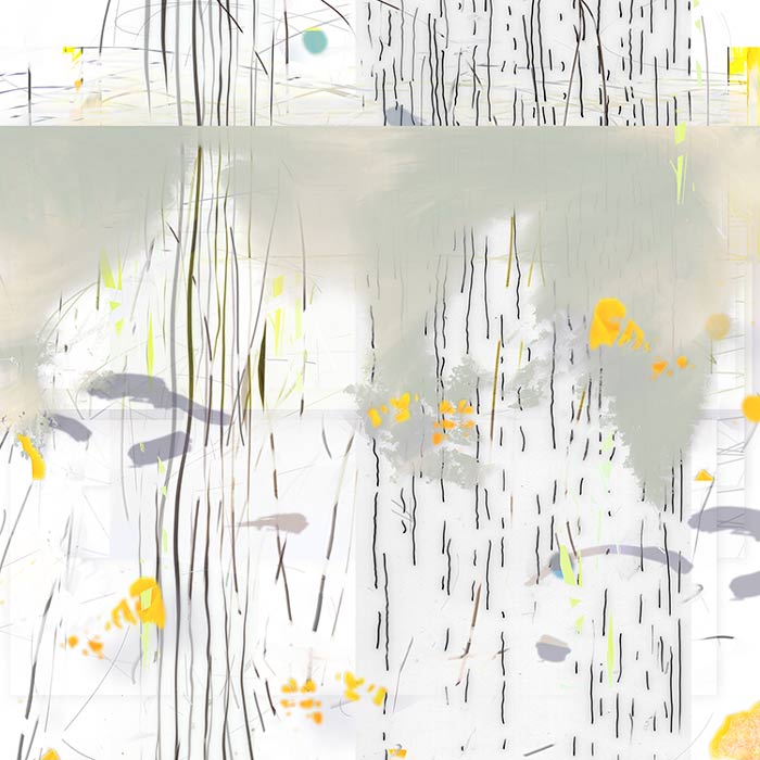
Wild Forest, No. 9 :
1/10 :
pigment ink on rag paper :
edition of 10 :
image size 30″h x 30″w, framed 3
Q. It’s pretty beautiful, how your mark-making starts to become confused with the branches from the photographic references in your pieces, like in the pieces Wild Forest, No. 9 and Wild Forest, No. 13. Tell me about the layering and manipulating of image/mark that you do to create this effect.
A. Using the iPad as a painting tablet has encouraged me to start using pieces of photographs in my paintings. I take literally thousands of photographs using my camera or my iPhone as everything around me seems to amaze me as the light changes over it. As I started playing with some of these photographs with my iPad, I would use the Procreate app to paint with my finger or with the Apple Pencil on the iPad. Sometimes I would create selections of bits of the photograph, and paint within those, and then would feel the need to paint over those painted selections or blur them to make them more painterly. In the end, I always bring everything into Photoshop so I can move layers around, add others, change their transparencies, add shadow layers, etc.
The little triangles of blue with bits of branches in them in Wild Forest, No. 9 came from a photograph that had a bit of blue sky over a tree in a cloud-filled sky after weeks of rain in California. I repeated that bit of blue sky several times as I’m quite partial to repeating forms. The warm greens were selections of leaves from a photograph of a birch tree next door to my yard in Ann Arbor. But I modified them so they would perhaps look a bit more painterly. But then I felt the piece needed some repeating geometry so I added the floating transparent squares with “leaves” and then wanted to try making them darker and felt they needed to be a cooler, less saturated green to contrast with the lighter warmer greens.
And since I love line, especially over atmospheric or translucent imagery, I just had to add my hand-drawn line across the top third of the piece.